

Table of Contents
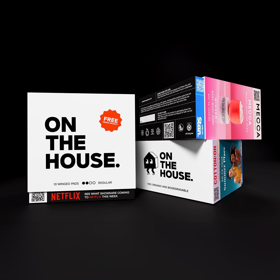
To Build Trust, Educate Users, and Support Period Poverty
On The House needed a digital presence that did more than just inform — it had to inspire trust, educate visitors, and support period poverty. The brief included:
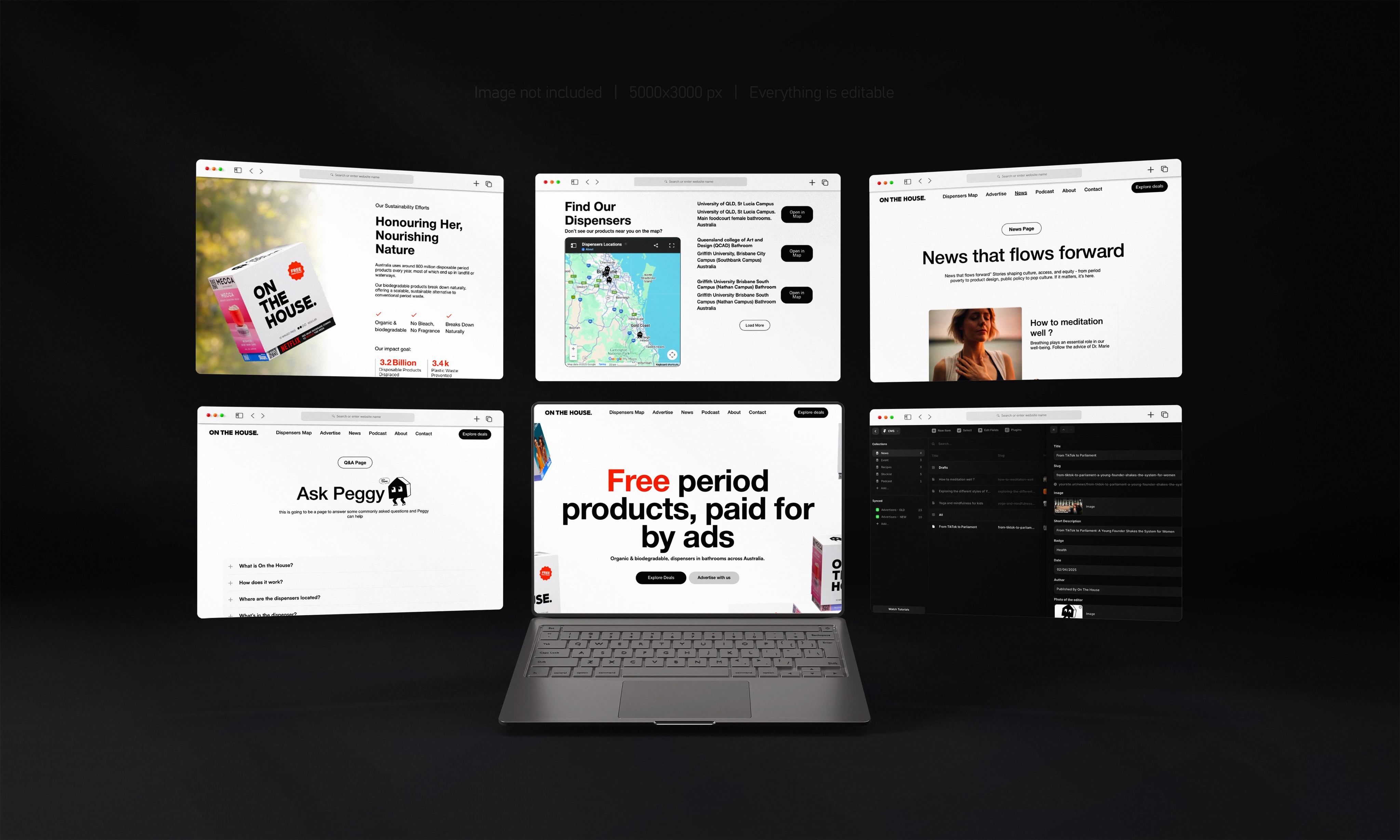
A marketing website that communicates the brand’s mission while supporting dynamic content like blogs and podcasts.
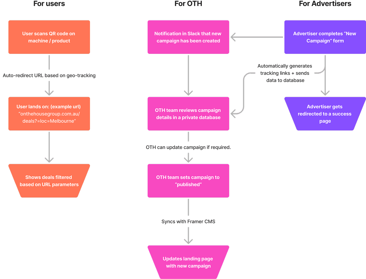
A QR-code landing page (Partner Perks) to deliver localized partner offers to users scanning product packaging — designed to be mobile-first, intuitive, and CMS-driven.
Insight-Led UX: Fast, Lean Research with a Human-Centered Lens
With limited time for formal research, we used a lean AI-assisted approach to gain insight:
Competitor benchmarking to study UX patterns in purpose-driven brands
AI-generated personas to simulate user behaviors of socially conscious women in Australia
Social listening & keyword tools to uncover language, tone, and expectations around period poverty and free products
What we learned:
Brand transparency and ease of navigation
Users valued brand transparency and ease of navigation, especially when exploring social initiatives.
Guidance on building trust on brand
Visual trust signals (like certifications, clean typography, and testimonials) were important to convert visitors into supporters or partners.
3 Design Principles we came up
To ensure a professional and empathetic experience that aligned with On The House’s mission, we focused on:
Accessibility
WCAG-compliant color contrasts, large tap targets, and semantic HTML for screen readers.
Clarity:
A clean and modern layout, concise messaging, and consistent typography to enhance readability.
Scalability:
CMS integration to support growing content such as blog posts, podcasts, and ongoing campaigns.
Early Drafts
We started with low-fidelity wireframes in Figma to plan out core content blocks, CTA placements, and user flow for both the homepage and advertiser landing page.
After internal feedback, we refined these drafts into higher-fidelity mockups before building directly in Framer. This allowed us to prototype transitions, responsive behaviors, and CMS logic in real-time.

Final Deliverables
I led the design and front-end development of the live website using Framer, delivering:

Impacts
The Results: A Platform Ready to Scale and Engage. The site is live and functional, and while long-term metrics are pending, early results show:
◤ Lightning-Fast Content Updates
Framer’s CMS enabled the team to publish content 300% faster with zero developer bottlenecks.
◤ Strong Mobile Engagement
Over 70% of Partner Perks traffic came from mobile QR scans within the first two weeks.
◤ Boosted Brand Credibility
A polished interface and smooth UX built confidence among early partners and stakeholders.
◤ Accessibility that Delivers
The site met WCAG standards, ensuring a usable and inclusive experience for all visitors.
Some Other UIUX Works


@designed by AddieCheung 2024