

Table of Contents
The Challenge: Make Law Feel Clear, Modern, and Accessible
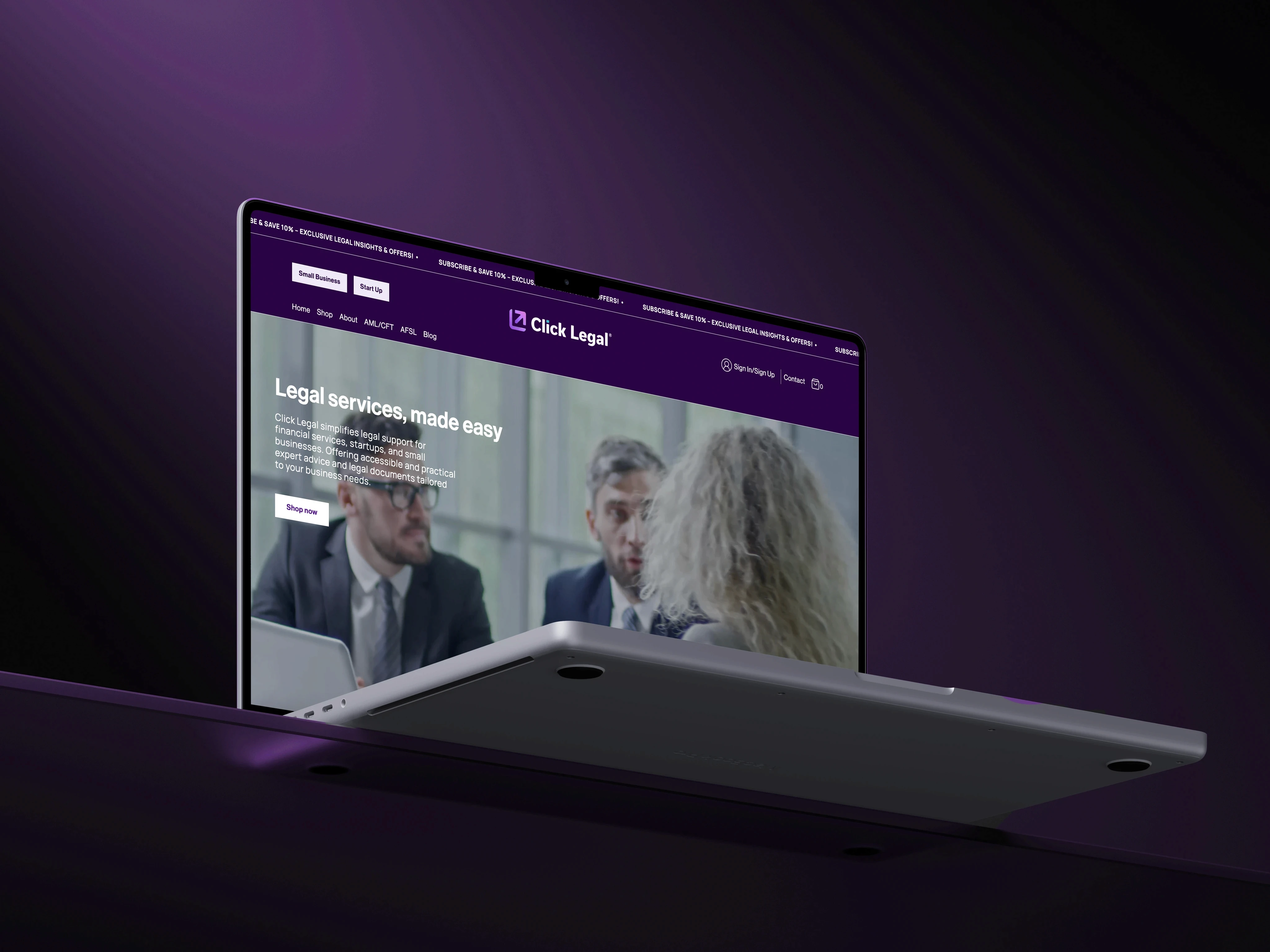
Click Legal is a Sydney-based legal subscription service helping small business owners and startups access expert legal advice with predictable pricing. The challenge? Translating a complex legal service model into a website that feels clear, credible, and compelling — all while guiding users through actions like exploring plans, signing up, and logging into a secure portal.
The design needed to strike a balance between professionalism and modernity, while also laying the foundation for a trustworthy legal tech brand.
Learning What Users Fear Most About Legal
To inform our direction, we conducted lightweight research with AI-assisted tools and synthesized real-world user insights through:
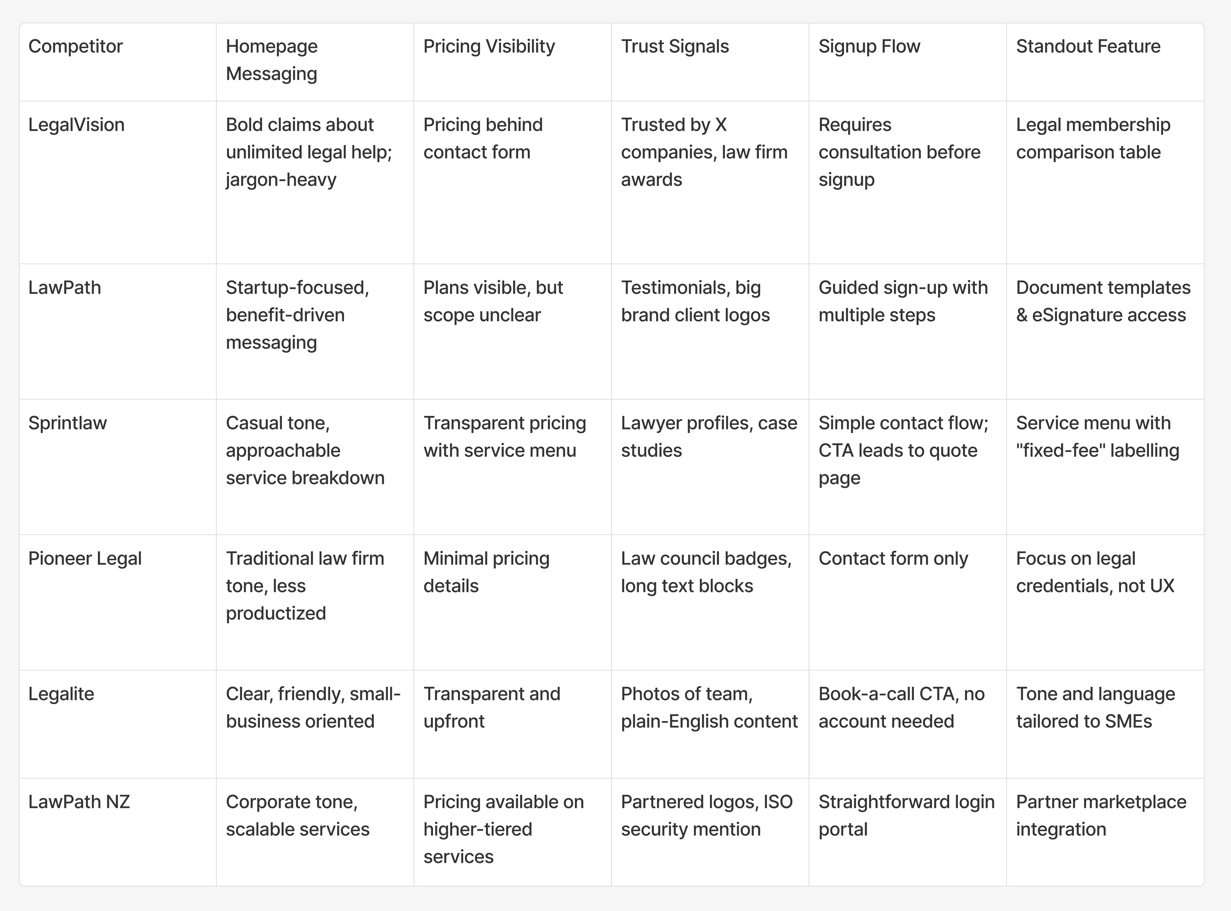
Competitor Mapping
Studied how other legal tech startups present pricing models, services, and trust-building elements.
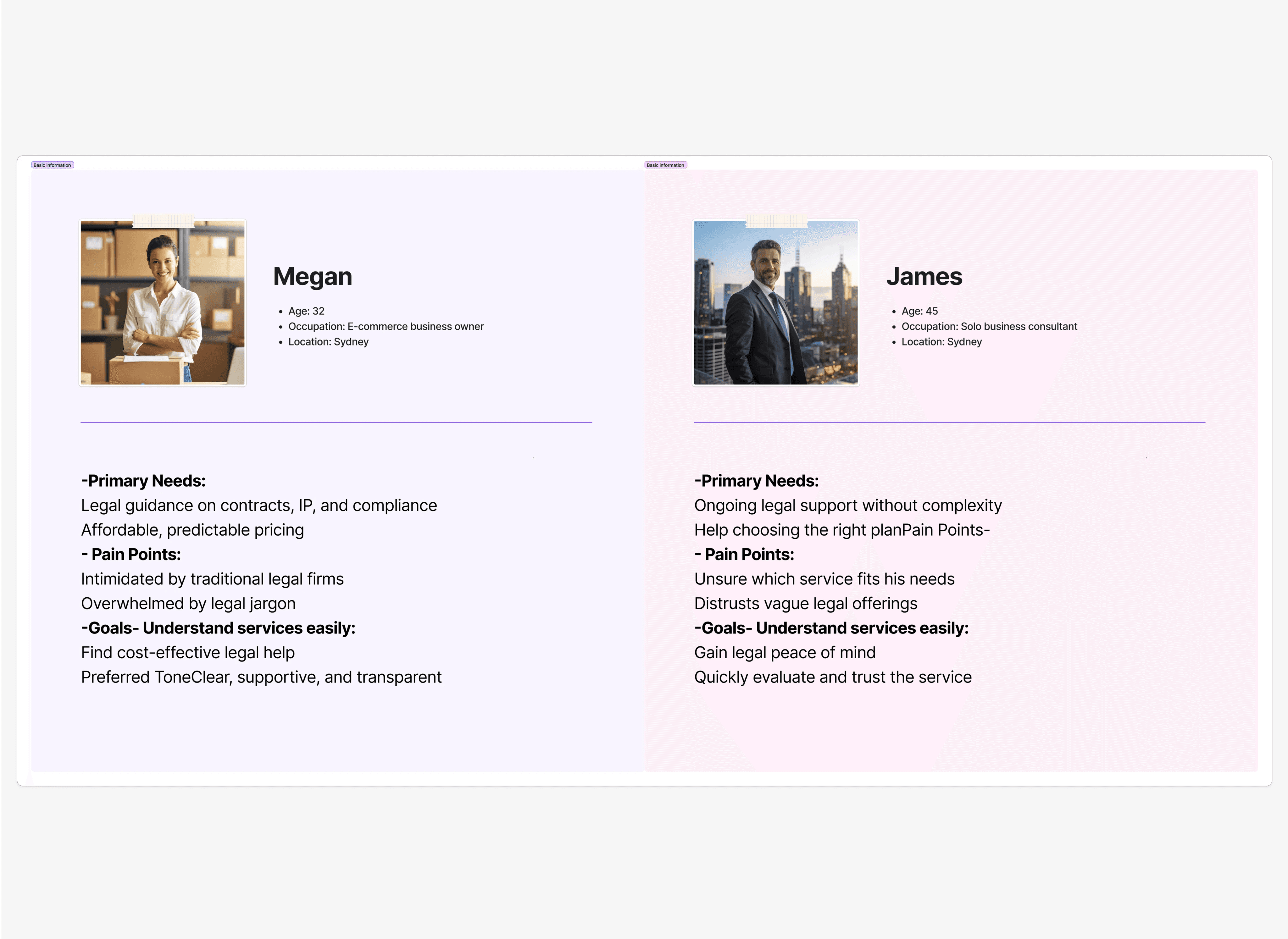
AI-Generated Personas
Created user profiles of time-poor small business owners with limited legal knowledge but growing compliance needs.
Pain Point Analysis:
Mapped common anxieties shared by startup founders — including “hidden fees,” “overly complex legal jargon,” and “unclear scope of services.”
What we learned:
Legal Jargon Overwhelms Users
Users wanted plain language and clarity, not intimidating legal-speak or vague packages.
Trust Is Earned in Seconds
A sleek, secure-feeling experience was essential to make users feel safe sharing sensitive information.
Users Want to Know Where They’re Headed
Clear navigation, logical flow, and “What’s next?” indicators were critical to conversion.
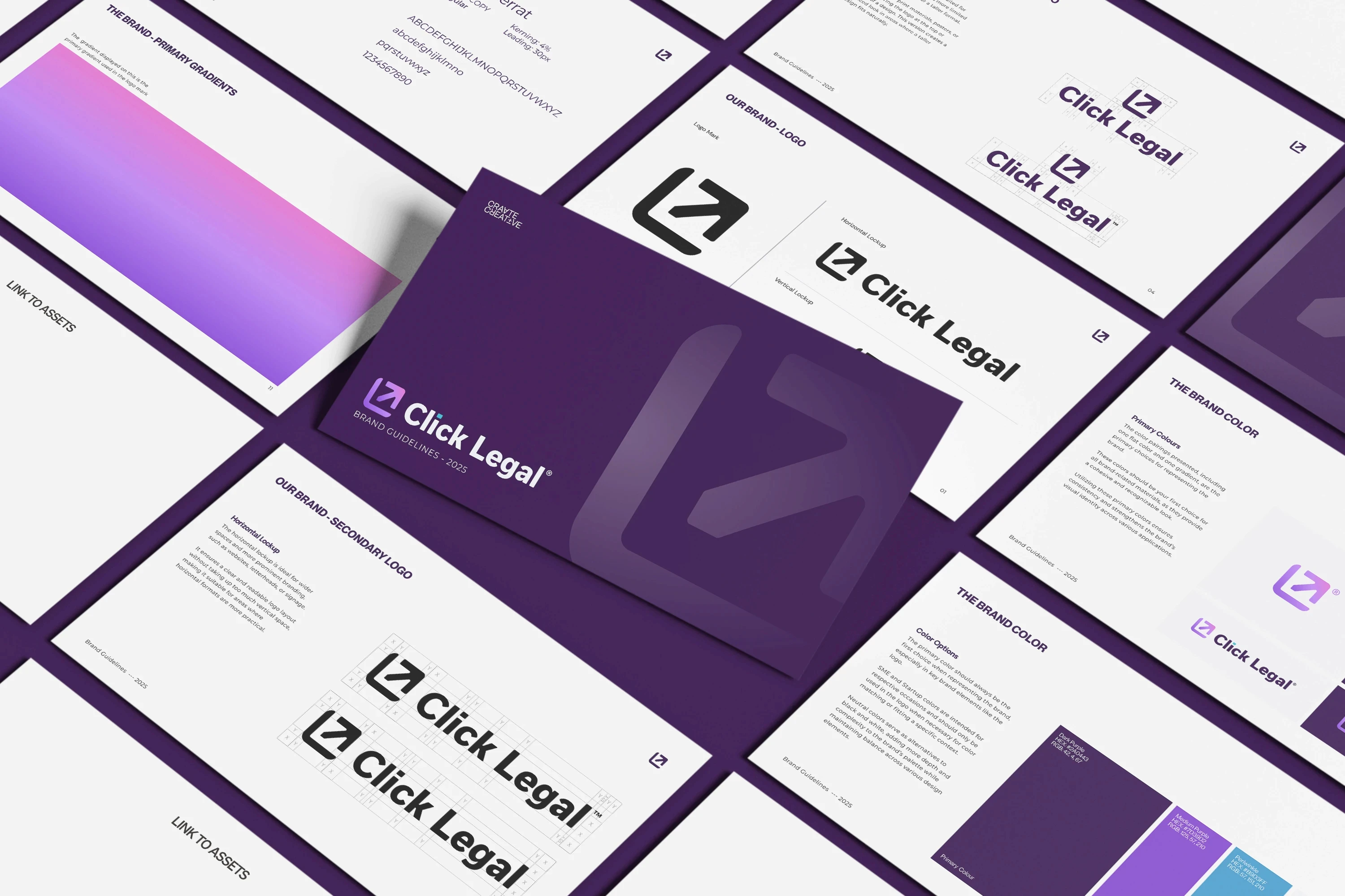
Design Direction: Corporate Elegance with Legal Clarity
Click Legal’s brand needed to feel established, not experimental, yet modern enough to compete in the legal tech space. We focused on:
Clean typography and calm, confident color tones
Structured layouts to convey order and logic
Minimalist visual language to avoid distracting users from the value proposition
Trust-building visuals, like testimonials, secure login prompts, and transparent plan details
From Concept to Final UI: Navigating Feedback and Flexibility
We began with wireframes in Figma, working through several layout structures and iterations in close collaboration with the client.
Adapting to Real-Time Feedback
The legal model was still evolving, so copy, plan details, and structure changed frequently, requiring us to stay flexible and ready to redesign quickly.
Once the UI was approved, I handed off the design to a front-end developer who implemented the site in HTML. I stayed closely involved to ensure design integrity throughout development.

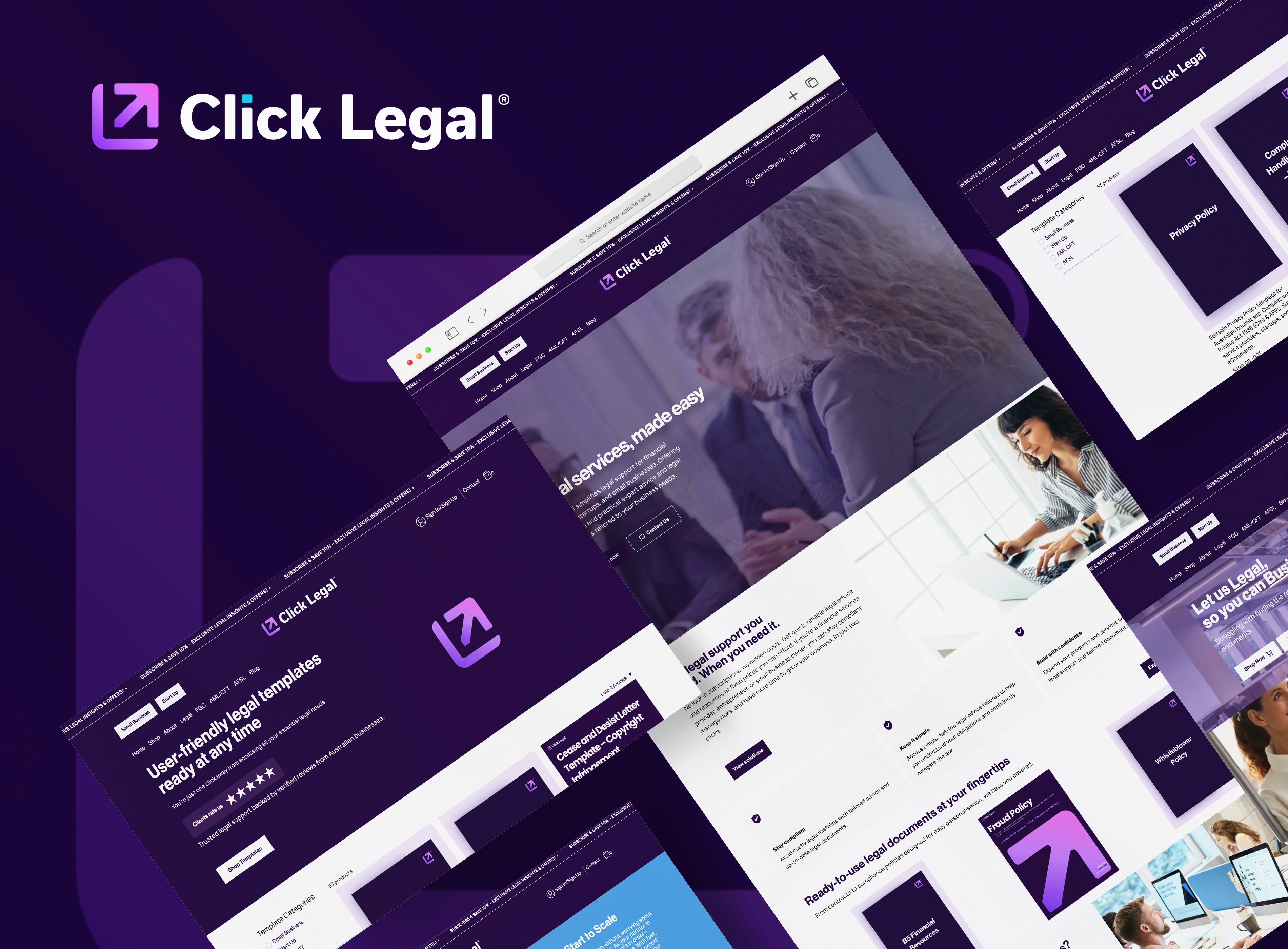
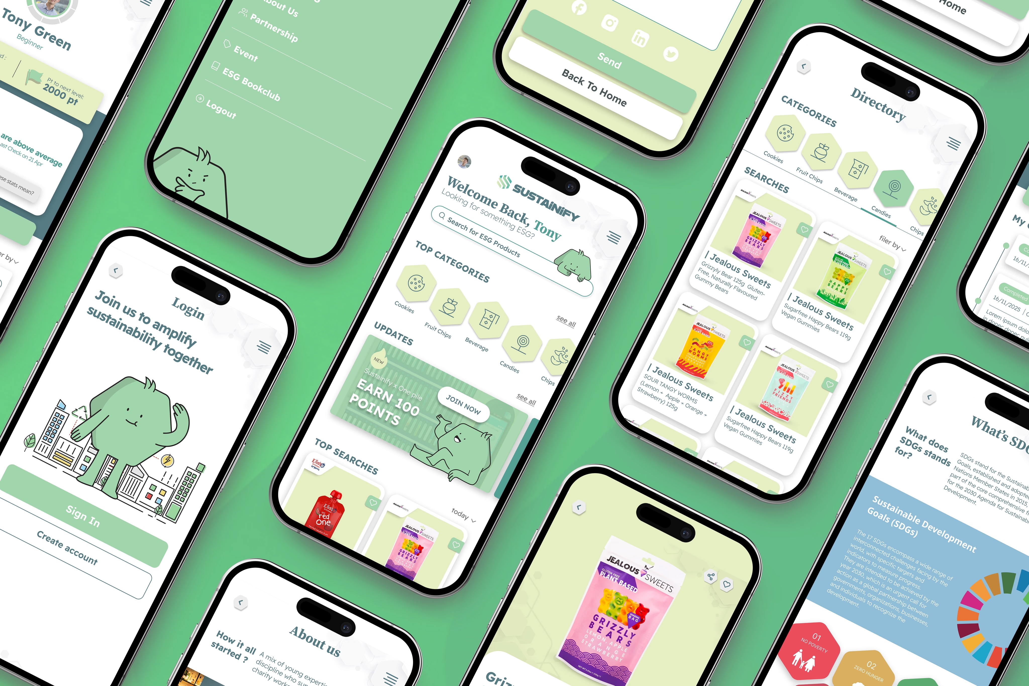
What We Delivered: A Credible Digital Face for a Modern Legal Service
As the lead designer, I delivered:
Complete brand identity: logo, typography, color palette, and visual tone
Impacts
◤ Faster Launch, Less Guesswork
Frequent iteration helped us clarify the offering and get the site live within a tight launch timeline.
◤ Reduced Confusion Around Legal Plans
Streamlined pricing pages and FAQ content helped demystify the subscription model.
◤ Clear Pathways to Secure Login
The login and portal entry point are visually clear and feel secure — a small touch with big trust implications.
◤ A Professional Brand That Scales
The identity and design system support long-term growth and evolving service offerings.
Some Other UIUX Works


@designed by AddieCheung 2024